


Did you spot these 4 Easter Eggs in our 2020 branding?

Thanks to our friends at Studio Papa, the magic of FRINGE WORLD was brought to life in this year’s awesome branding!
We had so much fun with it, that we thought we’d share some hidden gems with you…
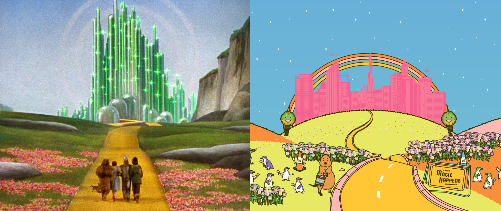
1. The branding is inspired by ‘The Wizard of Oz’
FRINGE WORLD is a cultural celebration that’s the best time of year in Perth and Western Australia, where we share the magic of our artists and venues for hundreds of thousands of people to enjoy.
The magical transformation of WA and some unique Westralianisms were key features of the 2020 Festival branding, with a design that drew inspiration from the classic Hollywood movie, The Wizard of Oz.
The branding featured Oz characters that were given a uniquely Western Australian and Fringey spin.
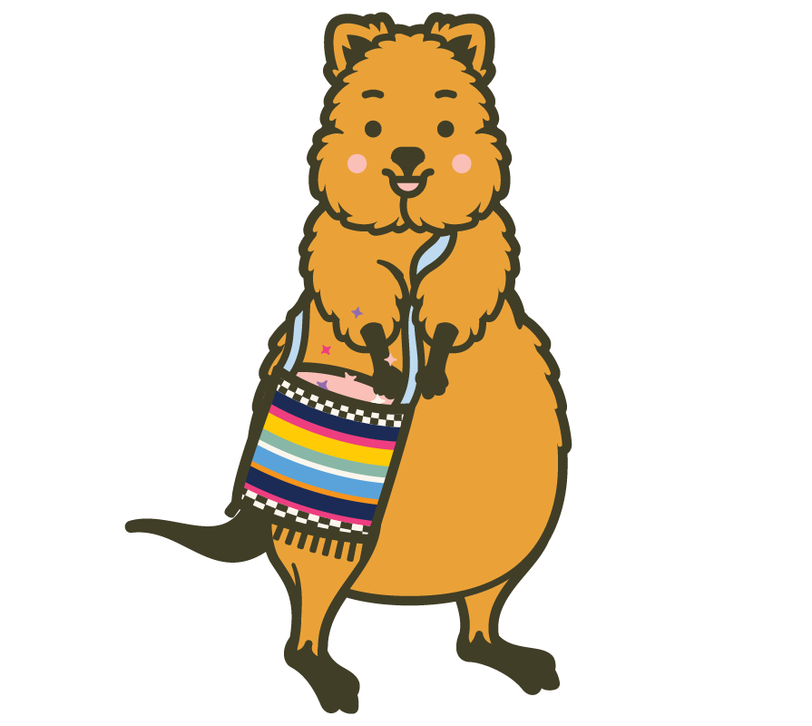
Rottnest’s fearless quokka as Oz’s lion. The quokka is the world’s friendliest animal and never shy’s away from a selfie opportunity. Cute!
Rockingham’s delightful Fairy Penguins, inspired by the Good Witch of the South, Glinda.
Australia’s unique fire-flourishing plant that populates our Fringe hub at Yagan Square and beyond; the Grass Tree is the perfect fit as the Scarecrow.
Sprinklers hold a special place in the hearts of anyone who grew up under WA’s hot dry sun, and ours pay homage to the Tin Man.
Whereas the Wicked Witch of the West terrorised in The Wizard of Oz, here in WA we recognise that a construction witches’ cone can be a necessary evil as they symbolise the ongoing transformation that’s taking place in our state.
FRINGE WORLD’s take on The Wizard of Oz would not be complete without one more adorable native animal…the numbat! Western Australians are a resilient bunch, and our state’s native animal emblem is no less; there’s less than 1,000 of them in the wild but they are not giving up.
2. Our quokka is holding an iconic Fremantle hippie bag
The little quokka spreading FRINGE WORLD magic across the city is sporting an iconic, colourful tote bag, just like the one you can find at the Fremantle Markets!
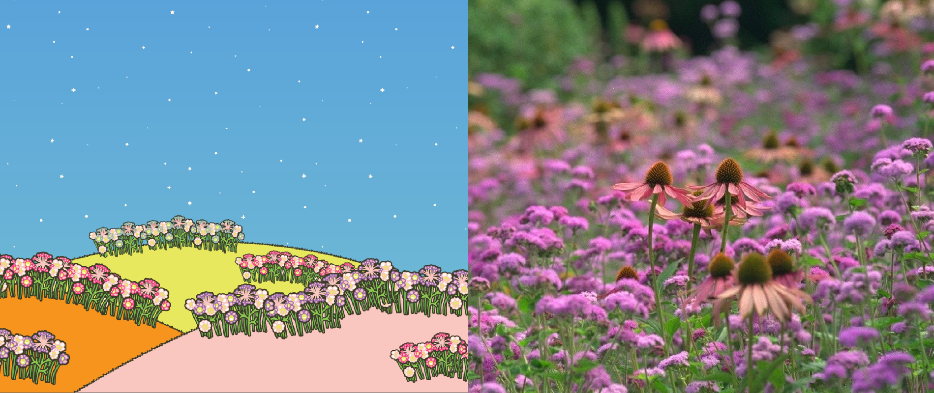
3. The flowers are based on the wildflower fields of Esperance
Western Australian’s wildflowers are a big tourist attraction and are simply stunning.
The flowers in our branding are representations of some of the native flowers of Esperance; specifically, the Pink Cone Flower and the Esperance Wax.
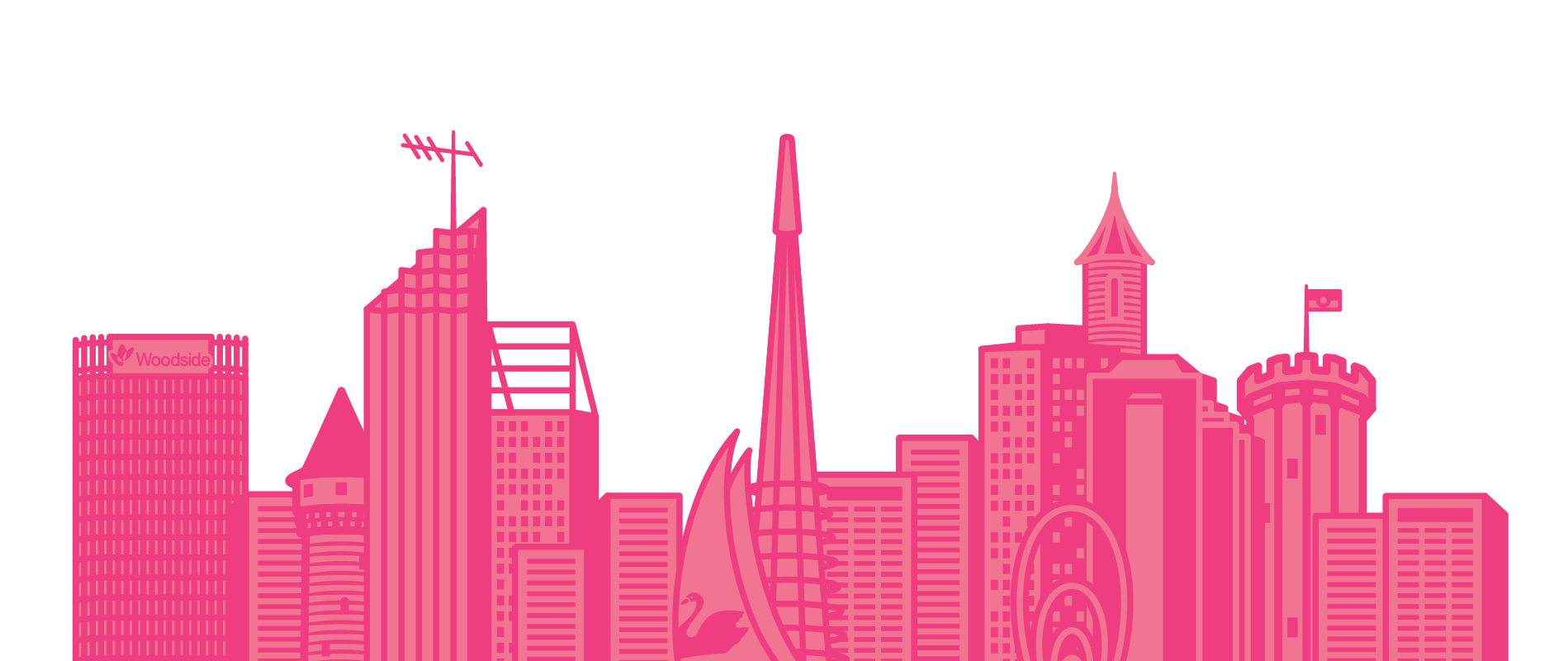
4. The city skyline is made up entirely of real Perth buildings
Oz’s Emerald City becomes the pink city in our branding, because Fringe pink transforms Perth and beyond for the month of FRINGE WORLD!
You may have spotted our Bell Tower and the Elizabeth Quay Spanda, but if you look closely, you’ll see that the skyline is entirely made up of real Perth buildings like the Bankwest tower, Woodside’s Mia Yellagonga building, Brookfield Place and Exchange Plaza.
Studio Papa has been making FRINGE WORLD look its very best since 2013.
Based in Perth, Studio Papa helps the Festival devise and design a suite of identities that are distinctively, unapologetically and parochially Western Australian; celebrating the unique spirit of FRINGE WORLD Festival.
They’ve helped bring the FRINGE WORLD magic to the pages of our guides and across the city; introducing the Festival to more and more audiences each year. They are also a valued partner of the Festival, and we thank them for their support.
Read more about behind the scenes of the FRINGE WORLD branding in previous years and check out some of the other amazing work that Studio Papa does here.